This post I will show the horror movie posters I looked at before creating our own one
Wednesday, 15 February 2017
Sunday, 12 February 2017
Friday, 10 February 2017
Wednesday, 8 February 2017
Poster Font & Image Decisions
This is about the image and font we picked for our poster.
Tagline - IT'S IN HER: We made it grey so it doesn't distract too much from the image but draws the audiences attention to it. It is in the font 'Source Sans Pro Extra' in size 36pt.
Tagline - REFLECTION: It is white so it stands out from the first line but still lets the audience focus on the image. It is the same font but in size 48pt.
Tagline - IT'S IN HER: We made it grey so it doesn't distract too much from the image but draws the audiences attention to it. It is in the font 'Source Sans Pro Extra' in size 36pt.
Tagline - REFLECTION: It is white so it stands out from the first line but still lets the audience focus on the image. It is the same font but in size 48pt.
A FILM BY HIBAH JAN & HANNAH T-J: This is in the font 'Source Sans Pro Extra Light' so it links to the tagline but doesn't distract the audience as this has to be small at the bottom. It is white and the top line is size 14pt and the bottom line is 12pt.
Fine Print: This is all the same font - Source Sans Pro Extra Light and is size 9pt-12pt. This is small as this is just the credits that go to the costume director etc.
Images we picked:
Sunday, 5 February 2017
Friday, 3 February 2017
Poster Shots/Use of Mise-en-scene
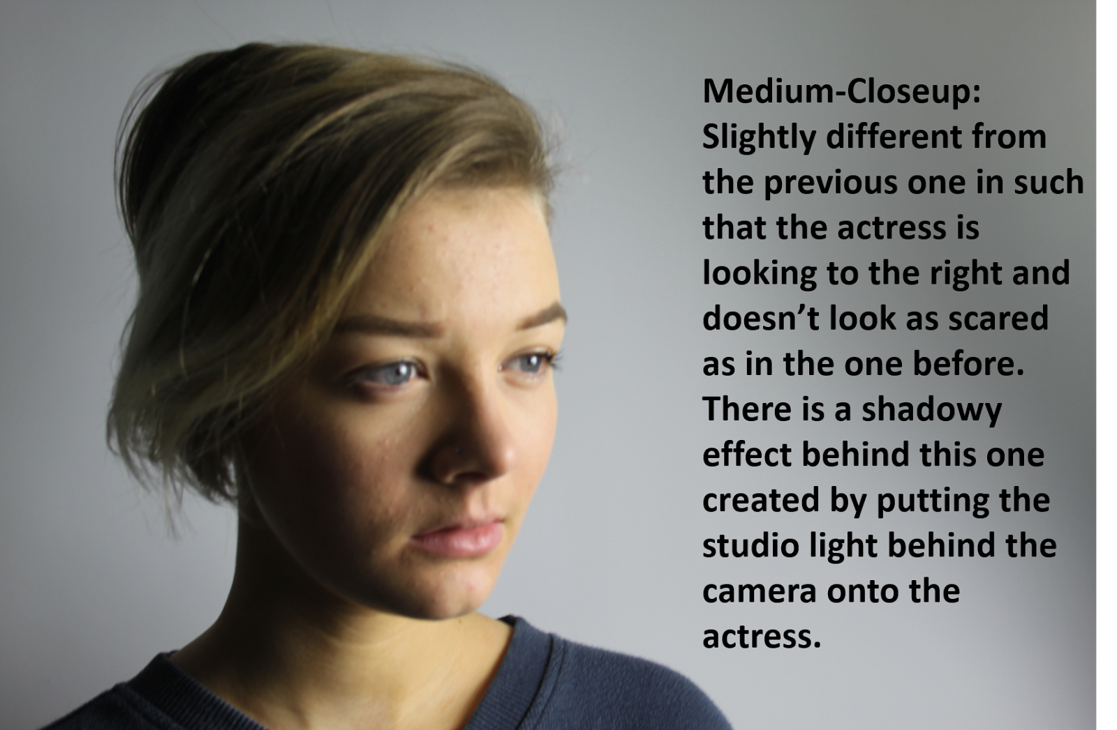
This post is about the shots my partner took for the Poster. They are taken at different angles and lighting.
Thursday, 2 February 2017
Construction linked to theories & storyboard
This Prezi shows the theories linked to my trailer and my trailer in relation to my storyboard,
Subscribe to:
Posts (Atom)